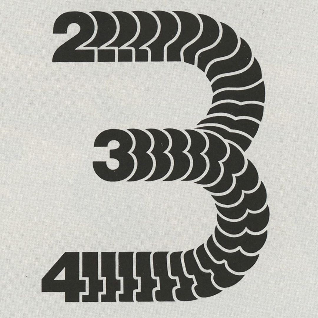
Marquee Along SVG Path
A component that scrolls html elements along an SVG path.
A start-to-finish tutorial on this component is available on Codrops.
Installation
1pnpm dlx shadcn add @fancy/marquee-along-svg-path
Usage
- Wrap your elements with the
MarqueeAlongSvgPathcomponent - Provide an SVG path via the required
pathprop (thedattribute of an SVG path) - Configure the SVG viewport with optional
viewBoxandpreserveAspectRatioprops for proper scaling - The elements are distributed evenly along the path, so you'll need to experiment with:
- The
repeatprop to control how many copies of your elements appear - The size of your elements (width/height)
- The
The component is really similar to the Simple Marquee Component, and has the same features and props (and a bit more:)):
- Changing velocity based on scroll velocity
- Slow down on hover
- Draggable elements
- Custom easing
Understanding the component
Before you dive into understanding this component, please read through the Simple Marquee component's documentation, as this one is almost identical.
The main difference is that we move the children along an SVG path (instead of a "straight line" positioned with flexbox system, as in the other component). The magic that makes this possible is the offsetPath CSS property.
The
offset-pathCSS property specifies a path for an element to follow and determines the element's positioning within the path's parent container or the SVG coordinate system. The path is a line, a curve, or a geometrical shape along which the element gets positioned or moves.
as per the offset-path documentation on MDN.
We also use the offsetDistance property to actually move/offset the element to the correct position along the path in the offsetPath CSS property.
Offset path example
1style={{2 ...3 offsetPath: `path('${path}')`,4 offsetDistance: itemOffset,5}}
Each item's offset is calculated separately using an useTransform hook from motion/react, by converting the baseOffset to a percentage value:
Item offset calculation
1const itemOffset = useTransform(baseOffset, (v) => {2 // evenly distribute items along the path (0-100%)3 const position = (itemIndex * 100) / items.length4 const wrappedValue = wrap(0, 100, v + position)5 return `${easing ? easing(wrappedValue / 100) * 100 : wrappedValue}%`6})
The items are evenly distributed along the path. The wrap function ensures that items surpassing 100% are "wrapped back" to 0%. The baseOffset value (the input value for the useTransform hook) is calculated by a bunch of different factors, such as:
- a base velocity, which moves the items along the path at a constant speed
- scroll velocity
- slowing down on hover
- direction
- drag velocity
Most of these factors are calculated inside an useAnimationFrame hook, which runs every frame. Most of these values are either motion values or refs to avoid unnecessary re-renders. Please refer to the Simple Marquee Component documentation, there is a detailed explanation for each part.
Z-Index Management
You can enable increasing z-index based on the progress along the path by setting enableRollingZIndex to true. This is pretty useful when a path is self-crossing, so elements further along the path appear above earlier ones.
The callback function which calculates the current z-index is fairly simple. You can set the zIndexBase and zIndexRange props to control the base and range of the z-index values. The zIndexBase is the starting value, and the zIndexRange is the difference between the highest and lowest z-index values.
Z-Index calculation
1// Function to calculate z-index based on offset distance2const calculateZIndex = useCallback(3 (offsetDistance: number) => {4 if (!enableRollingZIndex) {5 return undefined;6 }78 // Simple progress-based z-index9 const normalizedDistance = offsetDistance / 100;10 return Math.floor(zIndexBase + normalizedDistance * zIndexRange);11 },12 [enableRollingZIndex, zIndexBase, zIndexRange]13);1415// ...1617// Inside an element:18const zIndex = useTransform(19 currentOffsetDistance,20 (value) => calculateZIndex(value)21);
CSS Variable Interpolation
It's also possible to map any CSS property to the path progress using the cssVariableInterpolation prop. It accepts an array of objects with property and from and to values. High level example:
CSS variable interpolation example
1<MarqueeAlongSvgPath2 path="M0,0 C0,0 100,0 100,100"3 cssVariableInterpolation={[4 { property: "opacity", from: 0, to: 1.5 },5 { property: "scale", from: 0.1, to: 1 },6 ]}7>8 {/* Your content */}9</MarqueeAlongSvgPath>
Responsivity
When responsive is set to true, the component will automatically scale and center the entire marquee (SVG + elements) to fit within its container while maintaining aspect ratio.
Enabling responsive mode
1<MarqueeAlongSvgPath2 path={path}3 viewBox="0 0 996 330" // Important: set viewBox to match your path's bounding box4 className="w-full h-full"5 responsive6>7 {/* Your content */}8</MarqueeAlongSvgPath>
How it works:
- The component parses the
viewBoxto get the original dimensions - It measures the container's current dimensions using a resize listener
- It calculates a scale factor:
Math.min(containerWidth / originalWidth, containerHeight / originalHeight) - The marquee is scaled and centered using CSS
transform: translate() scale()
Important notes:
- Make sure your
viewBoxmatches the bounding box of your SVG path for proper scaling - The marquee will be automatically centered within its container
- This technique is simple and performant, but the marquee elements will also be scaled (smaller on smaller screens)
Alternative: D3-based Path Scaling
For more advanced use cases where you want the elements to maintain their size while the path scales, you can use D3.js to parse and recreate the path at new dimensions. This technique is covered in detail in the Codrops tutorial.
Notes
The component's performance may be impacted by the complexity and length of the SVG path, as well as the number of elements being animated. Keep an eye on it and tweak these factors if you experience performance issues.
Resources
Credits
Click on the individual images in the 2nd demo to see the original artworks & authors.
Props
| Prop | Type | Default | Description |
|---|---|---|---|
| children* | ReactNode | - | The elements to be scrolled along the path |
| path* | string | - | The SVG path string that defines the motion path |
| pathId | string | - | Optional ID for the SVG path element |
| preserveAspectRatio | string | "xMidYMid meet" | SVG preserveAspectRatio attribute value |
| showPath | boolean | false | Whether to show the SVG path |
| width | string | "100%" | Width of the SVG container |
| height | string | "100%" | Height of the SVG container |
| viewBox | string | "0 0 100 100" | SVG viewBox attribute value |
| baseVelocity | number | 5 | Base velocity of the animation |
| direction | "normal" | "reverse" | "normal" | Direction of the animation along the path |
| easing | (value: number) => number | - | Custom easing function for the animation |
| slowdownOnHover | boolean | false | Whether to slow down on hover |
| slowDownFactor | number | 0.3 | Factor to slow down by when hovering |
| slowDownSpringConfig | SpringOptions | { damping: 50, stiffness: 400 } | Spring configuration for hover slowdown |
| useScrollVelocity | boolean | false | Whether to use scroll velocity |
| scrollAwareDirection | boolean | false | Whether to change direction based on scroll |
| scrollSpringConfig | SpringOptions | { damping: 50, stiffness: 400 } | Spring configuration for scroll velocity |
| scrollContainer | RefObject<HTMLElement> | HTMLElement | null | - | Custom scroll container reference |
| repeat | number | 3 | Number of times to repeat children |
| draggable | boolean | false | Whether elements can be dragged |
| dragSensitivity | number | 0.2 | Sensitivity of drag movement |
| dragVelocityDecay | number | 0.96 | Decay rate of drag velocity |
| dragAwareDirection | boolean | false | Whether to change direction based on drag |
| grabCursor | boolean | false | Whether to show grab cursor when draggable |
| enableRollingZIndex | boolean | true | Whether to enable rolling z-index effect |
| zIndexBase | number | 1 | Base z-index value |
| zIndexRange | number | 10 | Range of z-index values |
| cssVariableInterpolation | Array<{ property: string, from: number, to: number }> | [] | CSS properties to interpolate along the path |
| responsive | boolean | false | Whether to enable responsive scaling and centering |