Media Between Text
A component that animates a media (image or video) between two text elements.
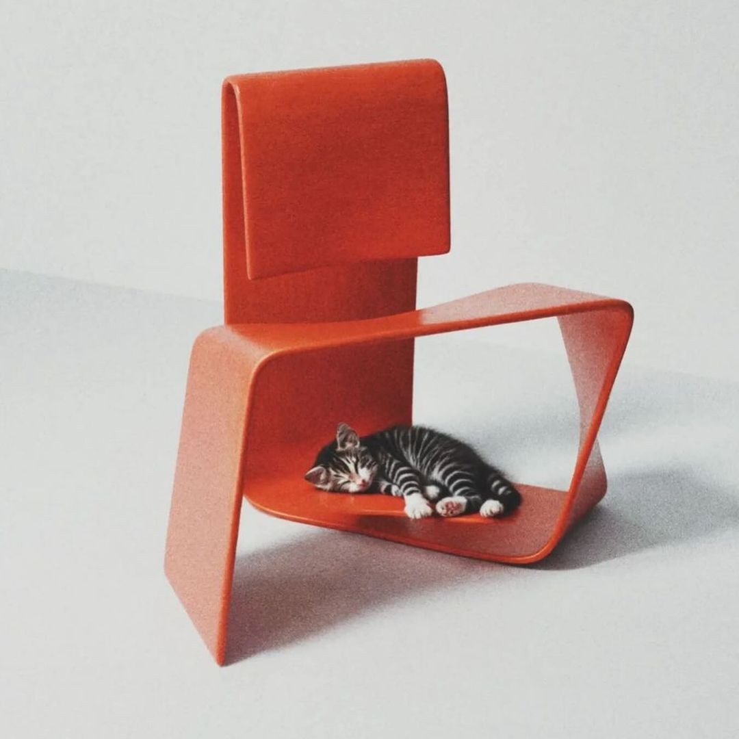
Artwork by Joffey
Installation
1pnpm dlx shadcn add @fancy/media-between-text
Usage
The component is extremely simple, and only consists of two text elements and a media element (either an image or a video). The trick for the smooth animation is to use layout animations on the two texts, so they smoothly transition when the media element is revealed.
You can trigger the media reveal animation by hover, ref, or inView:
hover: The media will animate when you hover over the componentref: You can call theanimateandresetmethods exposed via a ref to manually control the animationinView: The media will animate when the component is in view. You can pass anuseInViewOptionsPropprop to customize the in view detection. Refer to the motion documentation for more details.
You can also customize the animation by passing a animationVariants prop. Please use animate and initial variants. Refer to the motion documentation for more details.
Examples
Scroll
Scroll down to trigger the animation. In this case, you can pass down a containerRef prop to the component to track when elements come into view within that specific container, rather than the entire viewport. This is useful when you want to trigger animations based on scrolling within a specific scrollable container.
Artworks by Tim Rodenböker, polyhop, Andreion de Castro, Lorraine Li
Vertical & Ref
You can also style the whole container, the media element, and the text elements separately. In this example, we use a column-layout to create a vertical effect. The animation can also be triggered from outside the component, by calling the animate and reset methods exposed via a ref. Click on the "Open" button to trigger the animation.
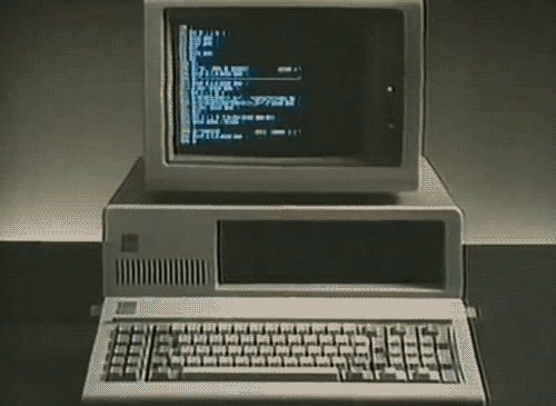
Video from chrbutler.com
Props
| Prop | Type | Default | Description |
|---|---|---|---|
| firstText* | string | - | The text to display before the media |
| secondText* | string | - | The text to display after the media |
| mediaUrl* | string | - | URL of the media (image or video) to display |
| mediaType* | "image" | "video" | - | Type of media to display |
| mediaContainerClassName | string | - | Optional class name for the media container |
| fallbackUrl | string | - | Fallback URL for video poster or image loading |
| as | ElementType | "p" | HTML Tag to render the text elements as |
| autoPlay | boolean | true | Whether video should autoplay |
| loop | boolean | true | Whether video should loop |
| muted | boolean | true | Whether video should be muted |
| playsInline | boolean | true | Whether video should play inline |
| alt | string | - | Alt text for image |
| triggerType | "hover" | "ref" | "inView" | "hover" | Type of animation trigger |
| containerRef | React.RefObject<HTMLDivElement> | - | Reference to container element for inView trigger |
| useInViewOptionsProp | UseInViewOptions | { once: true, amount: 0.5, root: containerRef } | Options for useInView hook |
| animationVariants | { initial: Variants["initial"]; animate: Variants["animate"] } | { initial: { width: 0, opacity: 1 }, animate: { width: "auto", opacity: 1, transition: { duration: 0.4, type: "spring", bounce: 0 } } } | Custom animation variants |
| className | string | - | Optional class name for the root element |
| leftTextClassName | string | - | Optional class name for the left text element |
| rightTextClassName | string | - | Optional class name for the right text element |