Image Trail
A component that creates a trail effect on cursor/touch movement. Works also with videos, svgs, or any type of html elements.
by Khoa Phan
Installation
1pnpm dlx shadcn add @fancy/image-trail
Introduction
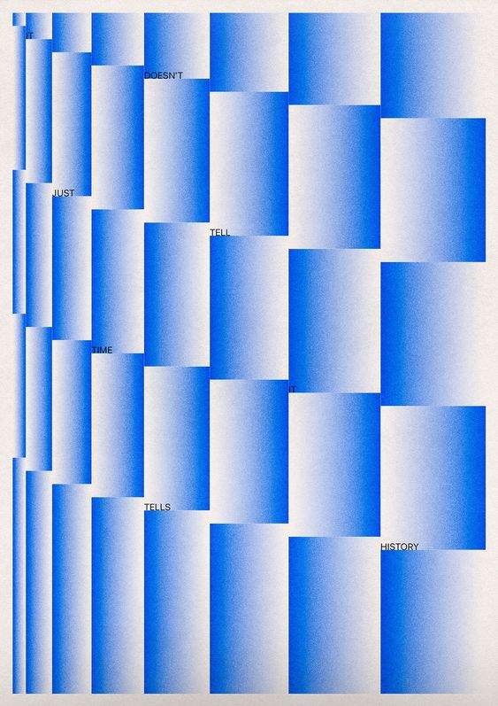
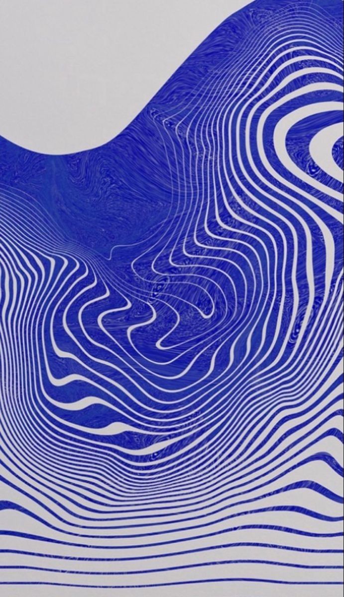
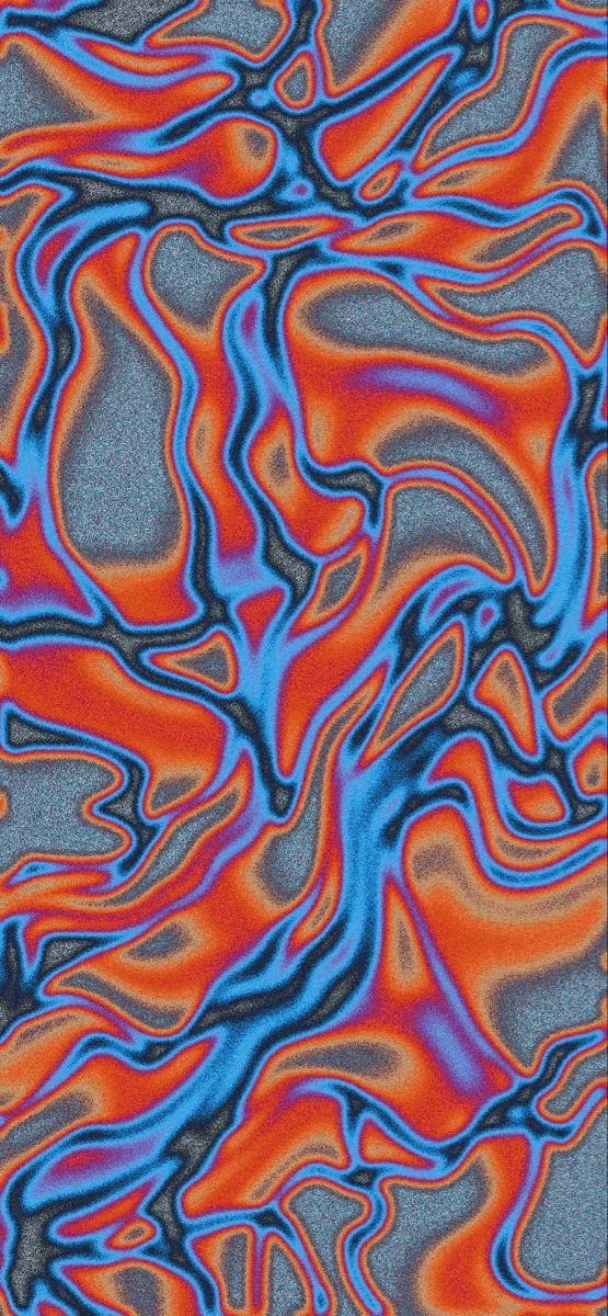
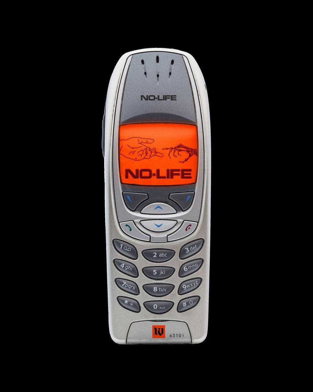
This component is a fun mouse interaction effect. The idea is to follow the mouse and show a trail of random images. It's a kind of brutalist effect and there are various possibilities when it comes to showing and hiding the images.
Usage
Wrap each image with the ImageTrailItem component and wrap everything with the ImageTrail as a parent component.
Image trail usage example
1<ImageTrail>2 <ImageTrailItem>...</ImageTrailItem>3 <ImageTrailItem>...</ImageTrailItem>4 <ImageTrailItem>...</ImageTrailItem>5</ImageTrail>
Understanding the component
The ImageTrail component creates its effect by tracking the mouse (or touch) position and animating a series of child elements (ImageTrailItem) to follow that movement with a configurable delay and visual style.
How the Trail Follows the Cursor
- Tracking Position: The component continuously monitors the mouse or touch position.
- Calculating Target Position (Linear Interpolation): Instead of instantly moving trail items to the current cursor position, it calculates a "target" position using linear interpolation (
lerp). This smooths out the movement.
Calculating target position
1const lerp = (a: number, b: number, n: number) => (1 - n) * a + n * b23//...45cachedMousePos.current.x = MathUtils.lerp(6 cachedMousePos.current.x || mousePos.x,7 mousePos.x,8 clampedIntensity9)1011cachedMousePos.current.y = MathUtils.lerp(12 cachedMousePos.current.y || mousePos.y,13 mousePos.y,14 clampedIntensity15)
- Controlling Responsiveness (
intensity): Theintensityprop (a value between 0 and 1) controls how quickly the calculated target position updates to match the actual cursor position.- Lower values (e.g., 0.1) result in a smoother, more delayed "momentum" effect, where the trail items lag behind the cursor.
- Higher values (e.g., 0.8) make the trail more responsive but less smooth.
- An intensity of
1positions the trail items exactly at the cursor's current position.
- Triggering Animation (
threshold): An animation cycle for the next trail item is only triggered when the cursor moves a certain distance. This distance is calculated using the Pythagorean theorem (Math.hypot):
Calculating distance
1const distance = (x1: number, y1: number, x2: number, y2: number) =>2 Math.hypot(x2 - x1, y2 - y1)
The threshold prop (default: 100 pixels) defines this minimum distance. No new trail items are animated until the cursor has moved at least this far since the last item was triggered.
Animating the Trail Items
When the movement threshold is met:
- Cycling Through Items: The component activates the next available
ImageTrailItemin the sequence. By default, it cycles through all children and repeats from the beginning. You can set therepeatChildrenprop to a number greater than 1 to duplicate the children internally and avoid immediate repetition. - Making Items Visible: Trail items are initially hidden (
display: none). When triggered, the next item is made visible (display: block) and starts its animation. - Animating Position: The core movement animation uses the
animatefunction fromMotion. Each triggered item animates itsxandycoordinates towards the continuously updatingcachedMousePos(calculated usinglerpas described above).
Customizing the Visual Animation
Beyond the position animation, you can control how each ImageTrailItem visually appears and disappears using the keyframes and keyframesOptions props passed to the main ImageTrail component.
keyframes: Define the states of the animation (e.g., scale, opacity). You should define the initial state (how the element appears) and the final state (how it disappears).keyframesOptions: Fine-tune the timing, duration, and easing for the properties defined inkeyframes. Thetimesarray within options specifies the progress points (0 to 1) at which each keyframe state should be reached.
Example:
Custom keyframes
1keyframes={{ scale: [0, 1, 1, 0], opacity: [0, 1, 1, 0] }}2keyframesOptions={{3 duration: 0.6, // Total duration for one item's animation4 scale: { times: [0, 0.1, 0.7, 1] }, // Scale keyframe timings5 opacity: { times: [0, 0.1, 0.7, 1] }, // Opacity keyframe timings6}}
In this example:
- The item starts invisible (
opacity: 0,scale: 0). - At 10% of the duration (
0.06s), it quickly scales up and fades in (opacity: 1,scale: 1). - It remains fully visible until 70% of the duration (
0.42s). - From 70% to 100% (
0.42sto0.6s), it scales down and fades out back to the initial state (opacity: 0,scale: 0).
There must be the same number of values in a times array as there are keyframes for that property. If times is omitted, the keyframes are spread evenly across the duration. You can read more about this in the Motion docs.
The component reuses DOM elements rather than creating new ones for each animation. It maintains a fixed set of ImageTrailItem elements that get recycled as needed. When an item needs to be triggered again, the component updates its position and restarts the animation without having to remove and remount elements in the DOM. For this recycling to work properly, make sure to define both initial and final states in the keyframes prop, as explained in the example above.
Z Index Stacking
The component automatically manages the z-index of the trail items to control their stacking order. You can customize this behavior using two props:
-
zIndexDirection: Controls whether newer or older items should appear on top"new-on-top"(default): The most recently triggered item will have the highest z-index"old-on-top": The oldest items stay on top, with new items appearing underneath
-
baseZIndex: Sets the starting z-index value (defaults to 0)
When a new item is triggered, the component maintains proper stacking by:
- For
"new-on-top": Setting the current item to the highest z-index and shifting all others down by 1 - For
"old-on-top": Setting the current item to the lowest z-index (baseZIndex) and shifting all others up by 1
Example with zIndexDirection="old-on-top":
That's it! :)
Non-image elements
The component is not constrained to be used with images, you can wrap videos, svgs, or basically any HTML elements inside a ImageTrailItem.
Notes
-
The
ImageTrailItemcomponent assigns a default className of.image-trail-itemto identify elements for animation within theImageTrailcomponent. Be cautious when applying customclassNamevalues with the same name (.image-trail-item) in your application, as this may cause conflicts or unintended behavior due to duplicate class selectors. To avoid issues, ensure custom classes are unique or use theclassNameprop to extend styles without overriding the default.image-trail-itemclass. -
When using the
ImageTrailcomponent, content is heavily animated. To prevent performance issues, avoid using overly large images or videos.
Props
Image Trail Wrapper
| Prop | Type | Default | Description |
|---|---|---|---|
children* | React.ReactNode | - | The content to be displayed |
| threshold | number | 100 | How much distance in pixels the mouse has to travel to trigger an element to appear |
| as | ElementType | div | HTML Tag |
| intensity | number | 0.3 | The intensity for the momentum movement after showing the element. The value will be clamped greater than 0 and less than or equal to 1.0 |
| keyframes | DOMKeyframesDefinition | - | Animation Keyframes for defining the animation sequence. Example: { scale: [0, 1, 1, 0] } |
| keyframesOptions | AnimationOptions | - | Options for the animation/keyframes. Example: { duration: 1, times: [0, 0.1, 0.9, 1] } |
| trailElementAnimationKeyframes | { x?: AnimationOptions, y?: AnimationOptions } | { x: { duration: 1, type: "tween", ease: "easeOut" }, y: { duration: 1, type: "tween", ease: "easeOut" } } | Animation keyframes for the x and y positions after showing the element. Describes how the element should try to arrive at the mouse position |
| repeatChildren | number | 3 | The number of times the children will be repeated |
| baseZIndex | number | 0 | The base zIndex for all elements |
| zIndexDirection | "new-on-top" | "old-on-top" | "new-on-top" | Controls stacking order behavior. "new-on-top": newer elements stack above older ones, "old-on-top": older elements stay visually on top |
| className | string | - | Additional CSS class names |
Image Trail Item
| Prop | Type | Default | Description |
|---|---|---|---|
children* | React.ReactNode | - | The content to be displayed |
| as | ElementType | div | HTML Tag |
| className | string | - | Additional CSS class names |